Comal Rojo – Tacos & Tex-Mex
Comal Rojo: Bold Restaurant Packaging Design Fort Worth Tex-Mex Rebrand
Every restaurant has a brand — but not every restaurant has a consistent one. Comal Rojo is a self-initiated rebrand project by The Food Nerds that asks a simple but powerful question: what happens when a beloved Tex-Mex concept finally looks as good as it tastes?
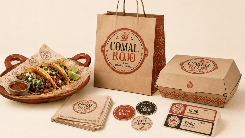
The answer is Comal Rojo — a complete brand overhaul built around restaurant packaging design Fort Worth taco lovers would recognize anywhere. From kraft paper bags stamped with a bold badge logo to salsa jar labels and to-go stickers, every touchpoint was redesigned to build trust, drive sales, and turn first-time guests into regulars.
The Problem: Inconsistent Branding Costs You Customers
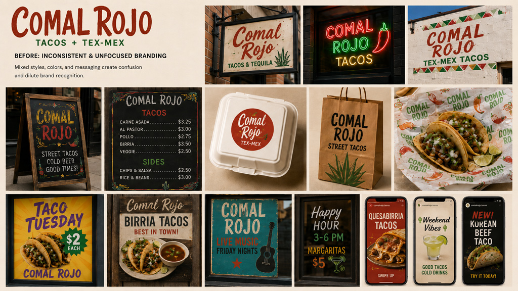
Before the rebrand, Comal Rojo had a visibility problem. Multiple logo versions, clashing color palettes, and inconsistent messaging across signage, social media, and packaging created confusion — not confidence. Guests couldn’t tell if they were looking at the same restaurant from one touchpoint to the next.
This is more common than most restaurant owners realize. Inconsistent branding quietly erodes customer trust, makes your business look less established than it is, and ultimately costs you sales. When a guest can’t immediately recognize your brand, they hesitate — and hesitation is the enemy of repeat business.
The Food Nerds set out to fix all of it. Investing in restaurant packaging design Fort Worth restaurants is one of the fastest ways to fix that.
The Solution: A Complete Tex-Mex Restaurant Rebrand
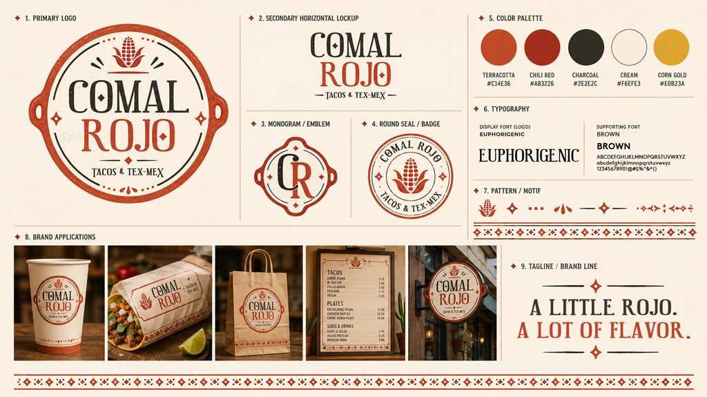
The new Comal Rojo identity is built on a single, ownable visual language — warm terracotta, chili red, charcoal, cream, and corn gold, anchored by a bold circular badge logo that feels rooted in Mexican heritage and completely at home in a modern Fort Worth dining scene.
The tagline “A Little Rojo. A Lot of Flavor.” captures the brand’s personality perfectly — confident, warm, and just a little bit bold. Every design decision from this point forward was made to reinforce that identity consistently across every single touchpoint.
Restaurant Packaging Design: Fort Worth’s Comal Rojo Gets It Right
The packaging suite is the heart of this rebrand — and the clearest demonstration of what great restaurant packaging design Fort Worth restaurants can achieve. Every piece tells the same visual story:
- Kraft paper bags stamped with the full badge logo and diamond pattern
- To-go boxes carrying the brand identity all the way to the guest’s front door
- Salsa labels for Salsa Roja, Salsa Verde, and Salsa Habanero — each distinct but unmistakably Comal Rojo
- Napkins and to-go order tickets that reinforce the brand at every point of contact
When packaging is this consistent, it doesn’t just hold food — it builds brand recognition one guest at a time.
Menu Board Design
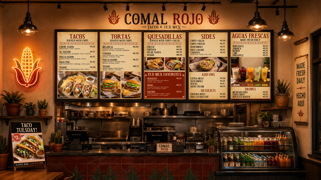
The overhead menu board is one of the most important and underestimated pieces of restaurant design. For Comal Rojo, it needed to organize a full Tex-Mex menu — tacos, tortas, quesadillas, sides, add-ons, aguas frescas, and desserts — clearly and beautifully, all while staying on brand.
The result is a menu board that guides guest decisions quickly and confidently, highlights signature items like the Quesabirria and Baja Fish taco, and makes the ordering experience feel as polished as the food itself.
Exterior Signage
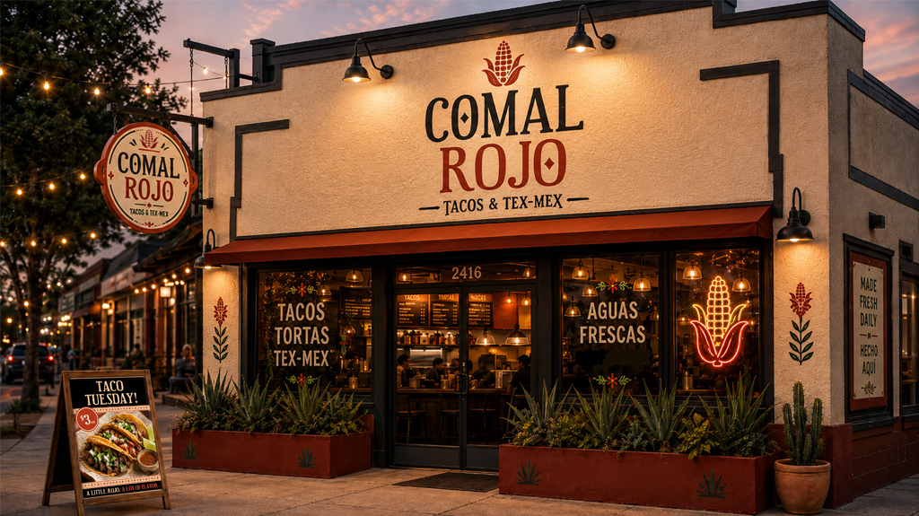
The exterior of Comal Rojo was redesigned to stop traffic — literally. A bold building sign, hanging badge, neon corn icon, and window graphics work together to communicate exactly what Comal Rojo is before a guest ever steps inside. The Taco Tuesday sidewalk sign reinforces the brand at street level, turning foot traffic into paying customers.
This is Tex-Mex restaurant branding Fort Worth diners recognize from a block away.
Social Media Design
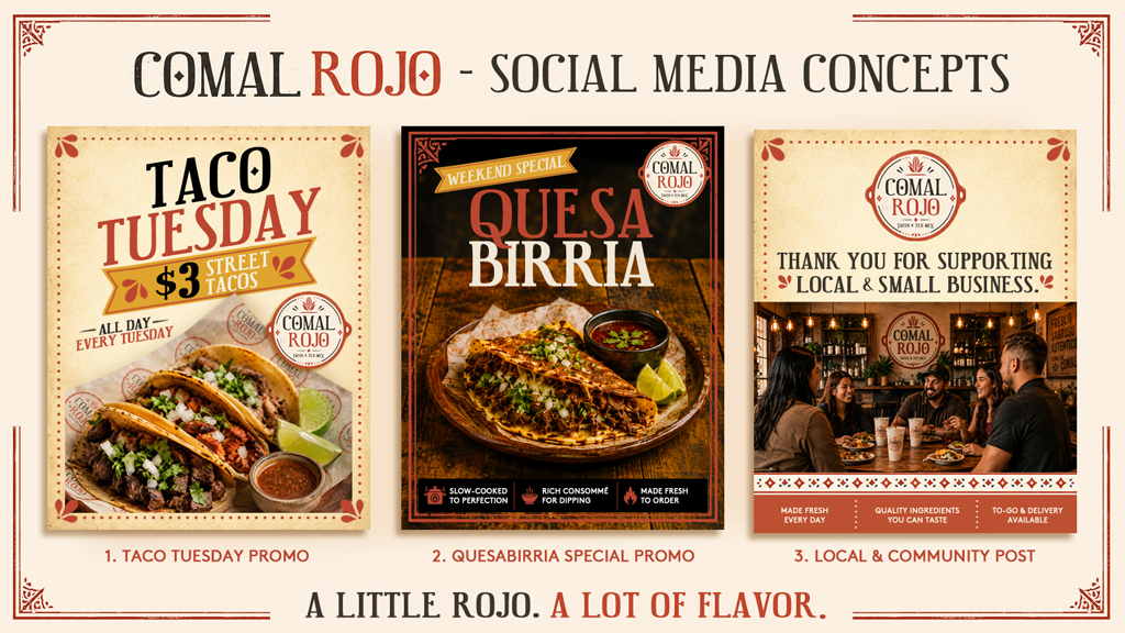
The Comal Rojo social media suite was built for today’s restaurant marketing environment — bold, vertical-friendly graphics that stop the scroll and drive action. From the Taco Tuesday promo to the Quesabirria Weekend Special and community appreciation posts, every graphic reinforces the brand voice while pushing real business results.
Great restaurant brand identity redesign DFW restaurants invest in doesn’t stop at the front door — it shows up on every screen your guests interact with.
Staff Attire
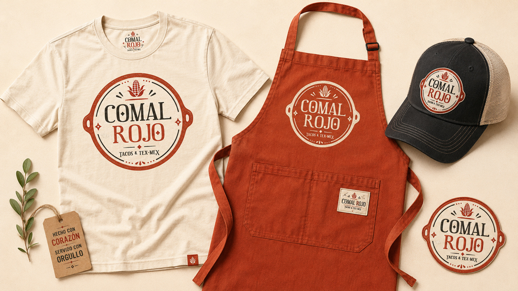
Brand consistency extends to the people behind the counter. The Comal Rojo staff attire system — t-shirt, apron, hat, and embroidered patch — turns every team member into a walking brand ambassador. When your staff looks as good as your packaging, guests notice. It signals professionalism, pride, and attention to detail that builds trust before a single taco is served. The same care that goes into restaurant packaging design Fort Worth guests interact with extends all the way to the people serving them.
What This Project Demonstrates
Comal Rojo is proof that a rebrand is one of the highest-return investments a restaurant can make. When your packaging, signage, social media, and staff attire all speak the same visual language, something powerful happens — guests trust you more, remember you longer, and come back more often.
For restaurant owners who recognize their current branding in the “before” images above, that’s exactly the point. The Food Nerds built this project to show what’s possible when inconsistent, unfocused branding gets replaced with a cohesive identity built for the real world.
With 20+ years of combined foodservice experience, we don’t just design brands — we understand the industry they live in. That’s the difference.
Interested in building a brand like this for your restaurant? [Get in touch with The Food Nerds.]