
Stockyard Smash Burgers
Stockyard Smash: Smash Burger Restaurant Branding from the Ground Up
When The Food Nerds set out to explore what fully realized smash burger restaurant branding could look like, Stockyard Smash was born — a self-initiated concept rooted in Fort Worth culture, built to feel like a real restaurant from day one.
Stockyard Smash is a Fort Worth-inspired casual dining smash burger house. Every design decision, from the logo system to the packaging, was made with one goal in mind: create a brand that feels bold, local, approachable, and built for a genuine dining experience.
The Concept
Fort Worth has a distinct identity — western heritage, blue-collar pride, and a community that takes its food seriously. Stockyard Smash leans into all of it. The name itself nods to the legendary Fort Worth Stockyards, grounding the brand in a sense of place that resonates with locals and visitors alike.
As a self-initiated project, this was an opportunity for The Food Nerds to explore smash burger restaurant branding without constraints — to ask what a brand could be when the only brief is “make it real.” This is the kind of smash burger restaurant branding that doesn’t just look good in a portfolio — it’s designed to function in the real world, under real conditions, for real guests.
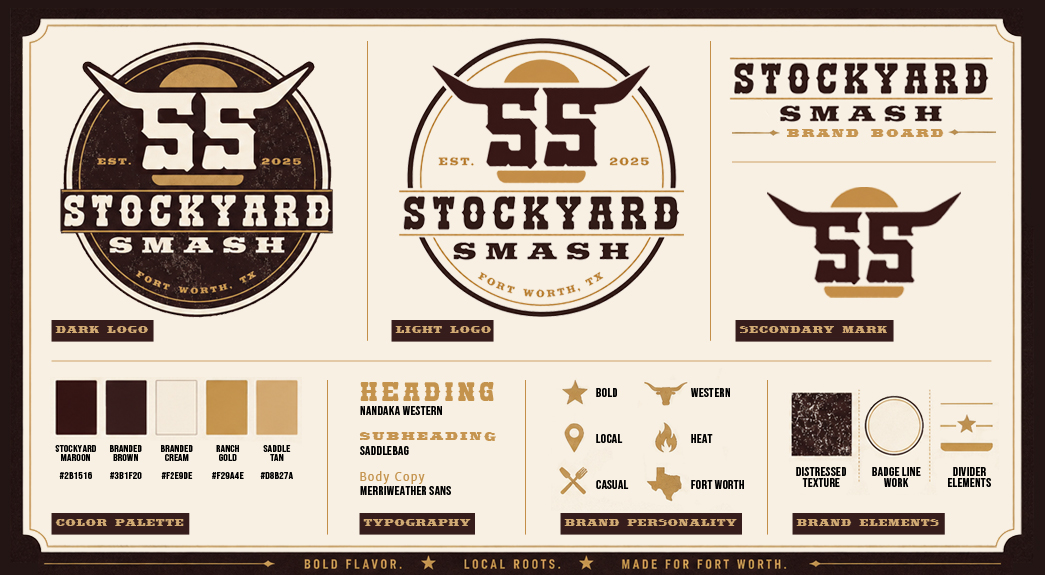
Brand Identity & Logo System
The logo system draws on western-inspired visual language — bold typography, rugged textures, and iconography that communicates strength and approachability in equal measure. The result is a mark that could hold its own on signage, packaging, and digital platforms without losing its character.
The color palette and type choices were selected to feel timeless rather than trendy — the kind of brand identity that works just as well on a paper bag as it does on a social media post.
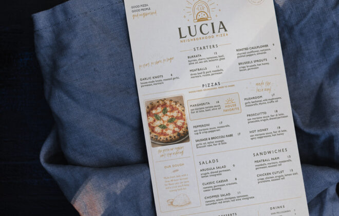
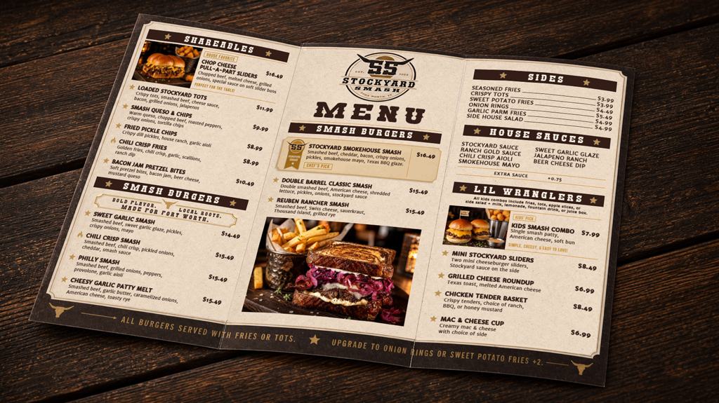
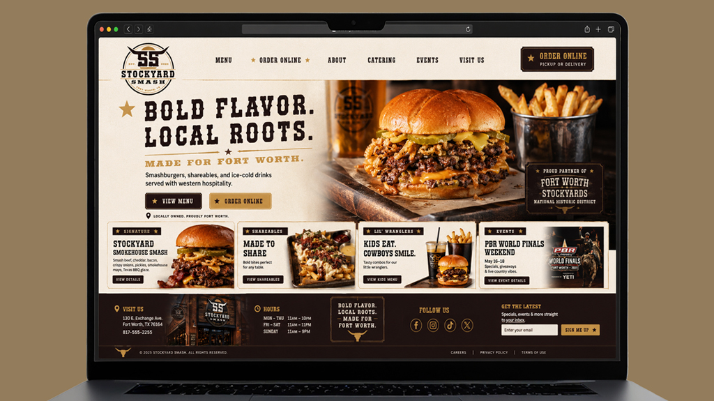
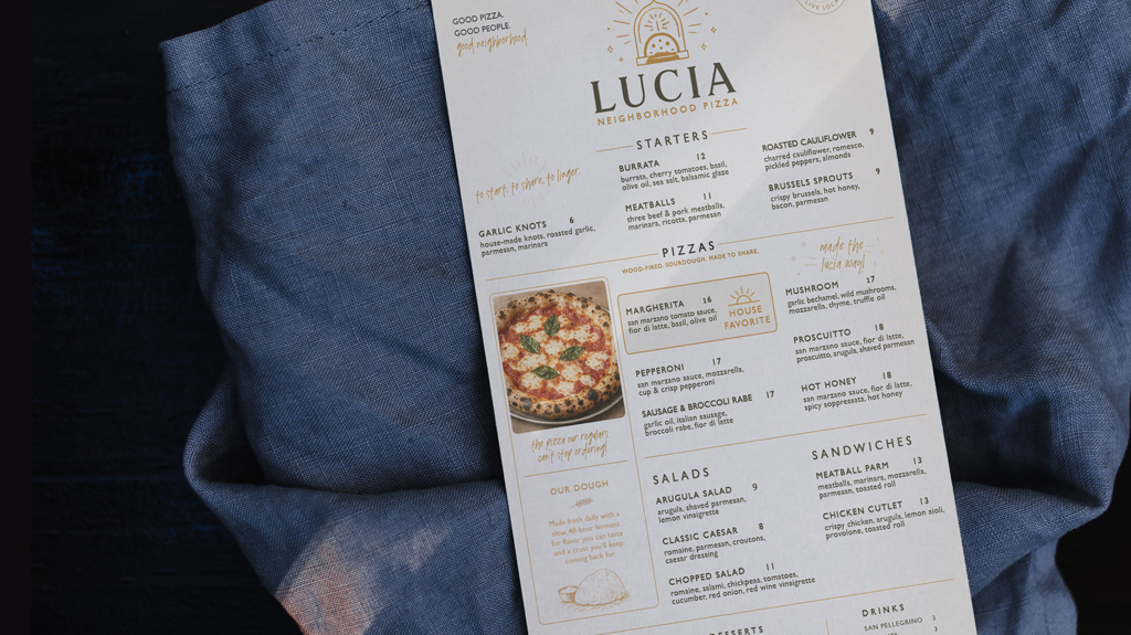
Menu Design
Menu design is one of the most important and overlooked parts of restaurant branding. For Stockyard Smash, the menu was designed to do real work — guiding guest decisions, reinforcing the brand voice, and highlighting signature items through strategic callouts and hierarchy.
Family-friendly sections were built in from the start, reflecting the casual dining experience the concept is built around. Every layout choice, from section headers to item descriptions, was made with both readability and sales performance in mind.
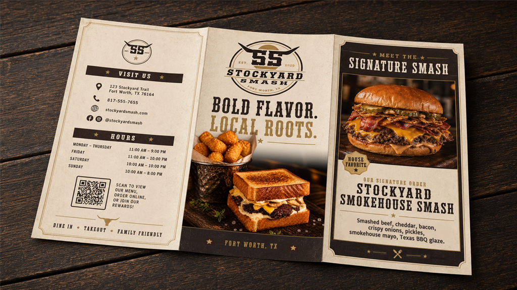
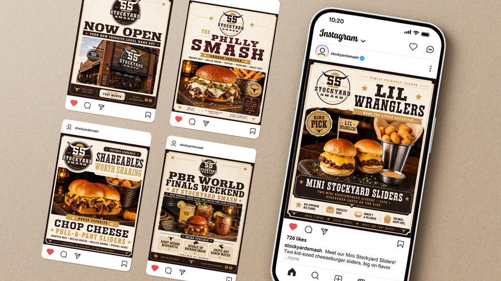
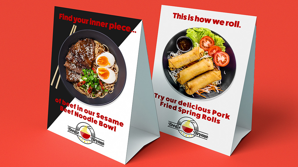
Food Photography & Styling
Great smash burger restaurant branding doesn’t stop at the logo — it extends to every image a guest encounters. The food photography for Stockyard Smash was styled and shot to match the brand’s bold, approachable personality. The goal was simple: make the food look as good as it tastes.
Each shot was composed to work across multiple use cases — menus, social media, delivery app listings, and in-store displays — ensuring the visual system stays consistent wherever guests interact with the brand.
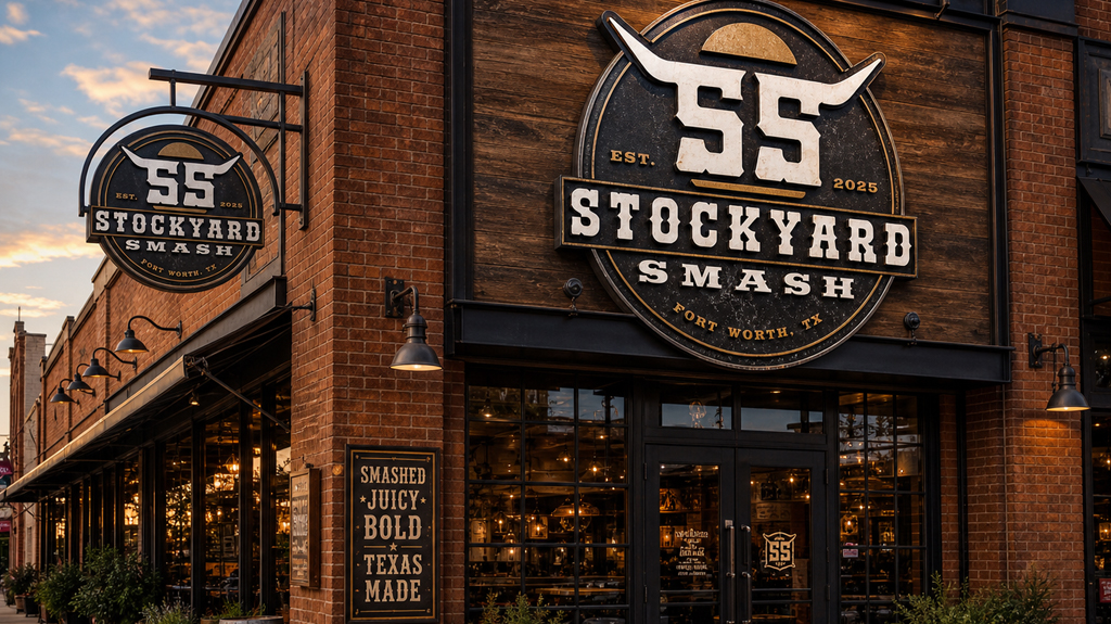
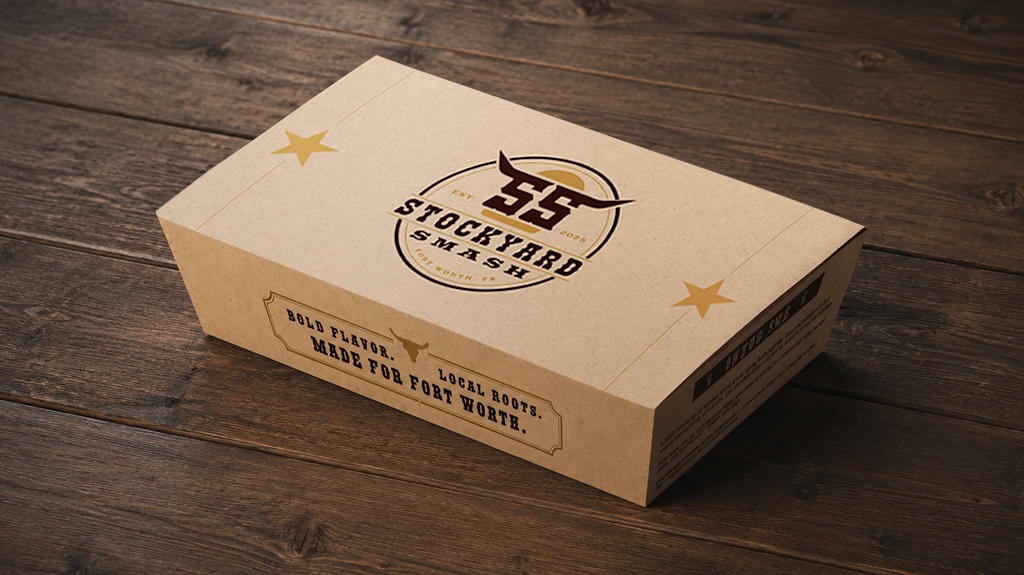
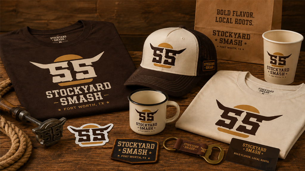
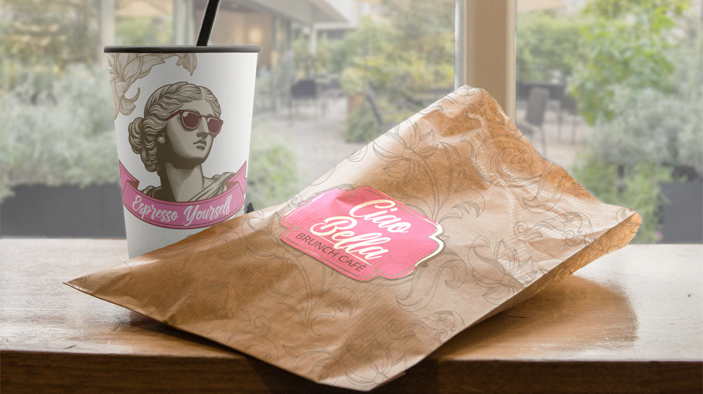
Signage & Packaging
From exterior signage to packaging touchpoints, every guest-facing element was considered as part of a cohesive brand experience. Signage was designed to command attention and communicate the Stockyard Smash identity at a glance. Packaging details reinforce the brand at the moment guests are most engaged — when the food is in their hands.
What This Project Demonstrates
Stockyard Smash is more than a portfolio piece. It’s a proof of concept — a demonstration of what thoughtful, full-service smash burger restaurant branding looks like when identity, environment, photography, and print all speak the same visual language.
For startup and independent restaurants looking to launch with confidence, this project reflects exactly how The Food Nerds approaches every client engagement: with curiosity, intention, and a deep respect for the industry.
Whether you’re launching a single location or building a concept from scratch, the Stockyard Smash project shows what’s possible when branding is treated as a business tool, not just an aesthetic choice.
Interested in building a brand like this for your restaurant? [Get in touch with The Food Nerds.]